The world is your oyster in the sea of kitchen selections.
With so much choice it can be feel difficult to know where to start when it comes to all the possibilities for your kitchen.
Follow these 4 basic guidelines to make beautiful, cohesive selections for the heart of your home.
Know your undertones
It’s all in the feeling. Kitchens can have all the latest mod cons and yet still feel not quite right. Spend time early on thinking about the type of feel you’d like your kitchen to have. Find some images you love, or colour combinations you always go back to, as a way of understanding what feels like home to you.
Deciding on a cool or warm vibe is a good place to start.
If you gravitate towards a cool look you will prefer the bluer whites and greys, so for you choose paints and tiles with a blue, green or purple undertone. On the other hand you may obsess over warm interiors, you will need to choose selections with a yellow, orange or red undertone. Sticking to this idea of cool or warm choices will mean your kitchen will look balanced and tied together as one whole space. It will save you those mistakes like having a neutral wall colour that ends up looking slightly pink, next to your tiled splash back that looks more blue than white! Stay true to your undertones and you’re 80% there.

Here's a kitchen selection I made based on warm orange undertones and complementing them with green. There are so many interesting selection schemes to create, and don't forget to use a mixture of textures and contrast for interest. Here is some leather and stone, along with smooth and grainy fabrics.
2. Think about the whole room
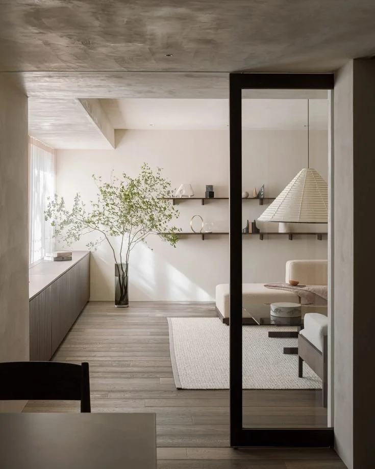
We can often fixate on our dream kitchen, all the while forgetting that it adjoins onto another main part of our living space. Don’t fall trap to this. These days our kitchens are more typically part of a larger, multi-purpose space. If you are only renovating your kitchen and it opens onto your dining or family room, continue to see the space as one big room. This is key to ensuring that your kitchen feels like it belongs in your home, rather than having a clash of styles when all the dust settles.
How do you do this?
Take note of certain colours or themes playing out in other parts of the room, and repeat them in your kitchen selections (unless of course you plan to renovate the rest of the space in the near future). Look at your flooring, window dressings, cushions and accessories as inspiration for your new kitchen space. Trust in your style and what resonates with you - these are the things that will make your kitchen belong.
3. Remember texture
Let’s focus down on a specific design element now. Texture. Want to know what is key to creating a kitchen that feels welcoming and homely? It’s all in the texture. We’ve all been in newly finished kitchens that feel as though they are missing some soul; and if you’re investing your time and money into a new kitchen you want to feel the love right from the word go. This is where texture plays a big role, but as ever the quiet overachiever it is often times overlooked.
What to do?
Consider a balanced mix of shiny and matt, rough and smooth materials. It’s these subtle elements that produce a kitchen that feels considered and enduring. Think in terms of a balance between light reflective and light absorbing surfaces. If you love a highly glossy benchtop, juxtapose this with matt-finish cabinetry, or shiny hardware with a cement look tiled splashback. Play opposites attract with your texture choices, and your kitchen will feel more authentically yours because of it.

Here’s my second kitchen selection based on the complementary colours of green and purple. This is another way to bring cohesion, in the same way that cool and warm undertones do. There's also lots of textures and use of contrast, along with fabric swatches to show how selections can be made with a multi-purpose room in mind!
4. Consider contrast.
We all know less is more, and with kitchen selections it really is. For a feature colour to look it’s best it usually needs to have something understated next to it to allow it to shine. The same can be said for a key material choice (think a gorgeous stone benchtop, or statement metal handles for example). For hero features to be just that, think about how you will balance them with more understated selections. Decide on your ‘wow factor’ and be ok with your other choices playing second fiddle. This considered use of contrast in your selections, and not needing everything to fight for attention, will help to create a beautiful balance in your kitchen. And this is the sort of kitchen that people don’t want to leave!
That’s a wrap on the 4 rules for beautiful kitchen selections. If you follow them you will be well on your way to having a kitchen with an intangible feel good factor, and you’ll know why.
Are you still feeling confused and overwhelmed in choosing your kitchen selections?
Design Release can help. Let us walk you through the process using our wide selection of samples, or we can meet with you at a showroom of your choice. We can work with builders at varying points of the design process, so don’t hesitate to get in touch to make the process smoother for you.


Thinking about refreshing your space in 2025?
Here’s what’s actually trending—and how to make it work for YOU without regrets.